Oct 20, 2024
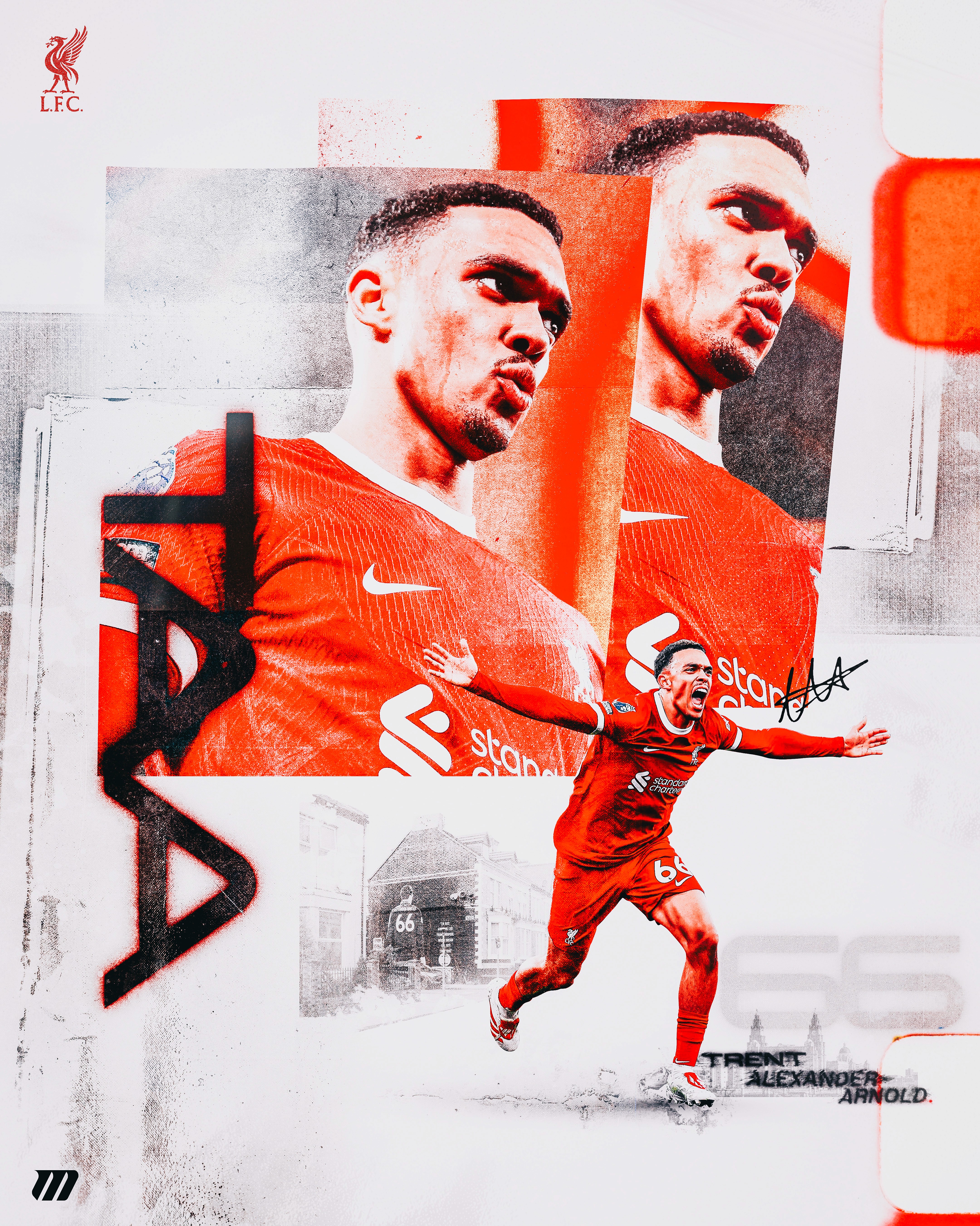
TAA × Liverpool — Poster Vol. 1
This poster marks my first post back — both a reset and a statement of intent. Rather than returning with something purely aesthetic, I wanted the work to be grounded in concept, identity, and design reasoning.
Poster Study
Sports
Poster Design
Process
Process Highlights
Identity over spectacle: concept-led approach
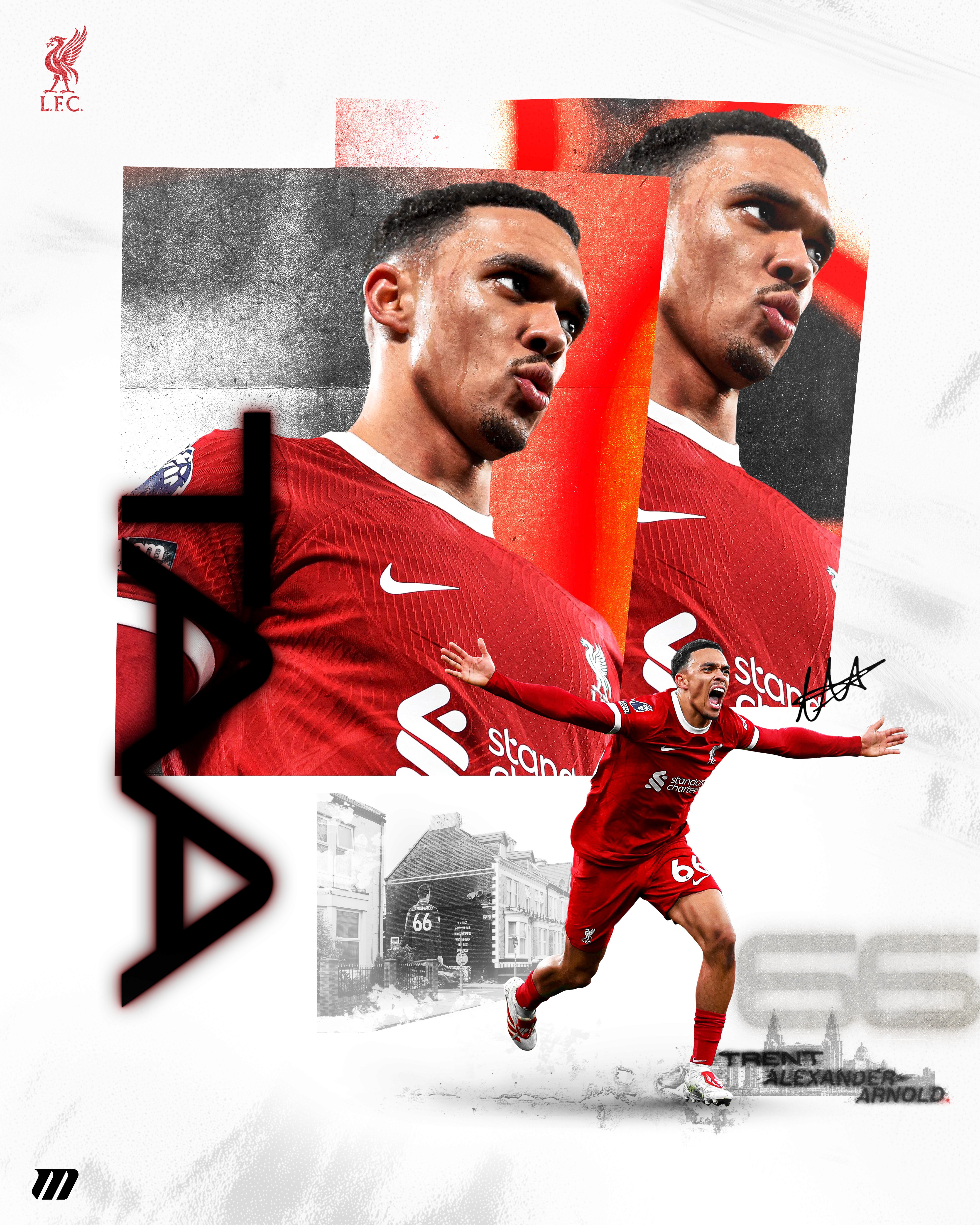
Typography treated as structural hierarchy
Restraint and control drove layout decisions
Reduction-based refinement rather than addition
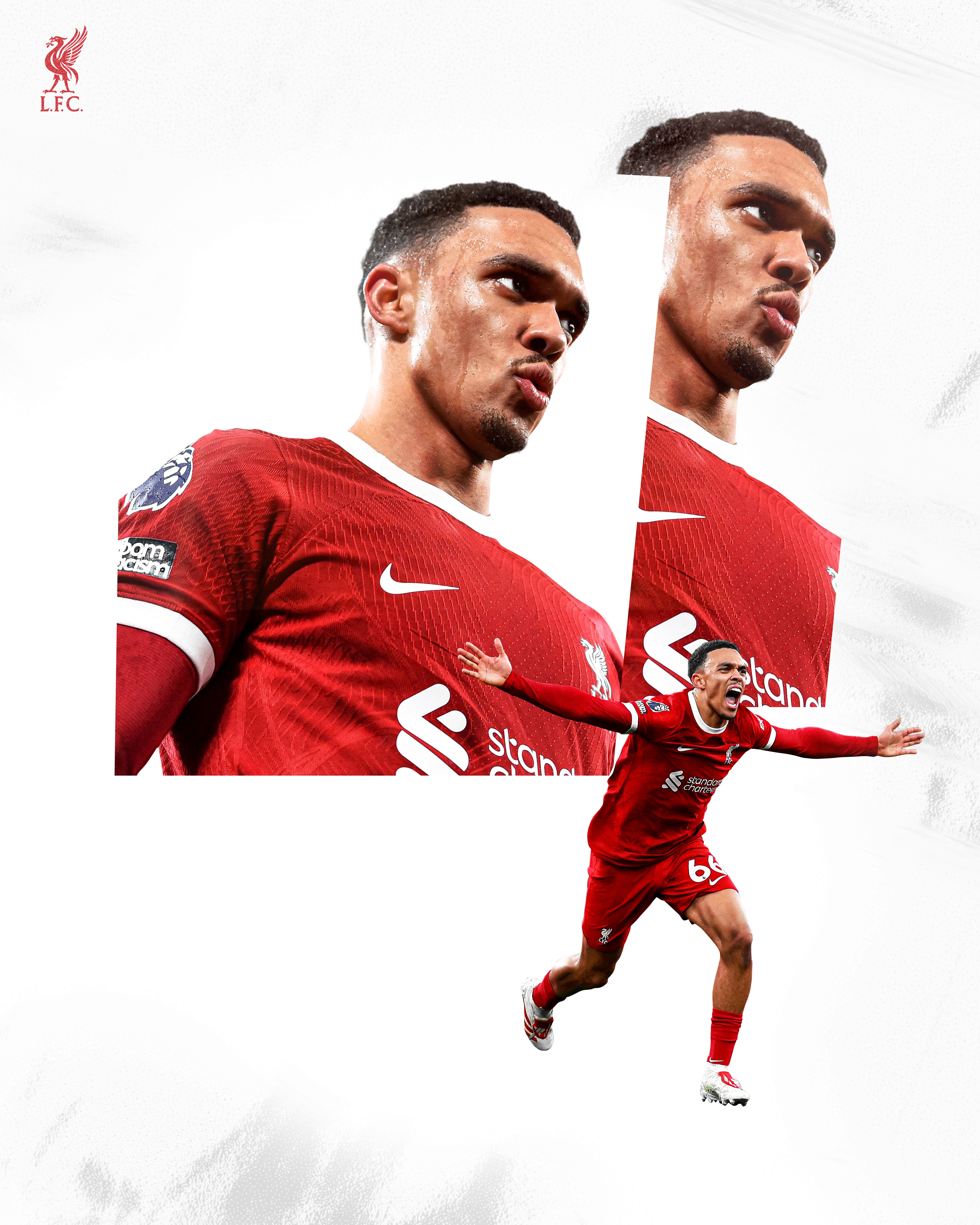
While listed as a right-back, his role within Liverpool’s system extends far beyond traditional defensive responsibilities. He dictates tempo, initiates attacks from deep areas, and controls space in ways typically associated with midfielders.
That contradiction — a defensive position paired with creative authority — became the core idea behind this poster. Rather than illustrating a single highlight moment, the focus was on presence: the calm before a diagonal switch, the awareness to spot runs early, and the confidence to attempt difficult passes repeatedly.

Image Use Note
This project is a personal, non-commercial design exploration. Player imagery has been heavily transformed and re-composed as part of an original graphic treatment. Source photographs remain the property of their respective rights holders and are used here for editorial and portfolio demonstration purposes only.
Concept & Direction
An editorial approach to sports poster design, built around control, precision, and restraint.
The aim was to create an editorial sports poster that communicates influence through structure rather than spectacle.
The concept was approached from an editorial perspective rather than a conventional sports graphic. I wanted the poster to feel considered and intentional — something that could exist comfortably in print as well as digitally.
Movement is suggested through hierarchy, spacing, and tension rather than overt action or effects. The aim was to communicate control without noise, reflecting how Trent influences games through intelligence and positioning rather than constant spectacle.
Design Decisions
Typography, colour, and layout choices were used as tools to communicate control and creative intelligence.
Typography plays a central role in this poster. The letterforms are bold, compressed, and tightly spaced, treated as a structural element rather than decoration. Early explorations included cleaner, more neutral typefaces, but these felt too passive and lacked the authority needed to reflect Trent’s impact on the pitch.
Colour choices were intentionally restrained. Liverpool red carries significant visual and emotional weight, so instead of leaning into nostalgia, contrast and texture were used to create a sharper, more contemporary feel. The palette supports the hierarchy rather than dominating it.
The layout is structured but asymmetrical. Elements avoid perfect centring and are allowed to drift slightly off-axis — a conscious decision referencing how Trent frequently moves into unexpected zones while still maintaining control of the game’s rhythm.
Process & Reflection
Refinement through reduction rather than addition.
From a process standpoint, the poster evolved through reduction. Early iterations explored stronger visual gestures and additional elements, but these diluted the core idea. Each revision focused on removing anything that didn’t directly support the concept of control, precision, and creative authority.
This piece sets the tone for how I want to approach future work — concept-led sports graphics with an editorial sensibility and a clear point of view. If revisited, I’d explore pushing the typography further, allowing it to break the grid more aggressively while maintaining hierarchy. That tension between structure and freedom feels like the most honest way to visually represent Trent’s role on the pitch.