Mar 2, 2025
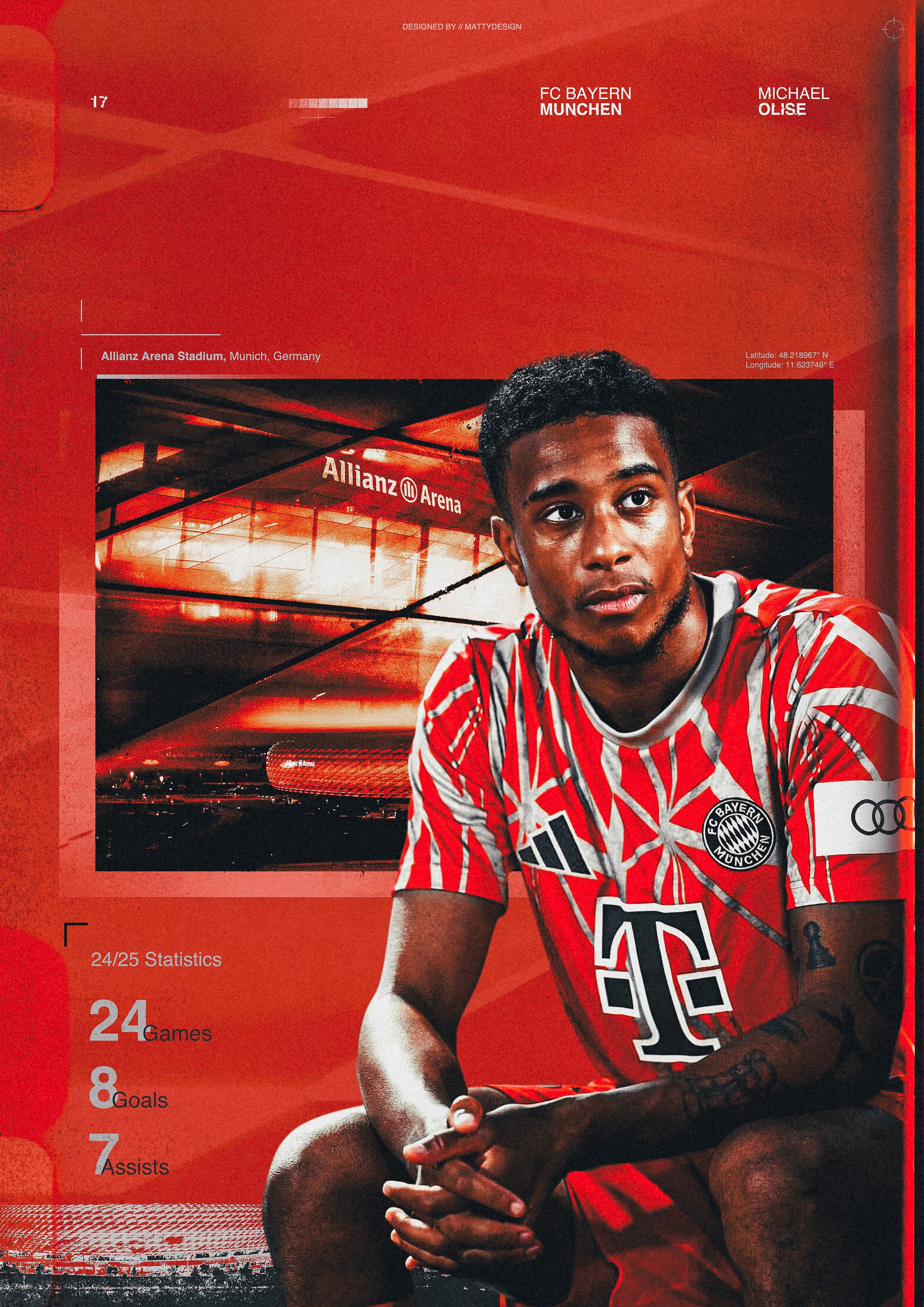
MICHAEL OLISE — BAYERN’S CREATIVE FORCE
This poster study focuses on Michael Olise and the idea of creative influence within structured systems. Rather than approaching the piece as a celebration of output or statistics, the aim was to explore how creativity, composure, and decision-making can shape a game at the highest level.
The poster translates Olise’s fluid dribbling, spatial awareness, and attacking intelligence into an editorial visual language — using typography, hierarchy, and restraint to communicate movement and control without relying on spectacle.
Poster Study
Sports
Poster Design
Process
Process Highlights
Identity over spectacle: creativity as the core narrative
Typography used to express rhythm, movement, and control
Fluidity and unpredictability informed layout decisions
Refinement through reduction rather than visual excess
The Moment
Michael Olise represents a different kind of influence on the pitch. His impact isn’t defined by physical dominance or constant motion, but by timing, intelligence, and composure. Operating between lines, he creates moments that feel effortless — subtle shifts of balance, quick changes of direction, and decisive final actions.
That contrast — calm control paired with unpredictable creativity — became the foundation of this poster. Rather than focusing on a single highlight or statistical achievement, the intention was to capture Olise’s feel for the game: the ability to slow moments down before accelerating them again.
This piece reflects a player shaping games through decision-making and movement rather than force.
Image Use Note
This project is a personal, non-commercial design exploration. Player imagery has been heavily transformed and re-composed as part of an original graphic treatment. Source photographs remain the property of their respective rights holders and are used here for editorial and portfolio demonstration purposes only.
Concept & Direction
An editorial sports poster focused on fluidity, rhythm, and creative intelligence.
The aim was to communicate influence through movement and structure rather than spectacle.
The concept was approached from an editorial perspective, prioritising balance and clarity over intensity. Unlike more rigid or aggressive sports visuals, the direction here allows elements to breathe — reflecting Olise’s ability to navigate tight spaces with ease.
Movement is suggested through hierarchy, spacing, and directional tension rather than overt action effects. The poster is designed to feel light but controlled, mirroring a player who creates freedom within structure.


Design Decisions
Typography, colour, and layout were used to express creativity without sacrificing control.
Typography plays a key expressive role in this piece. Letterforms are dynamic and slightly unconventional, echoing Olise’s unpredictable movement and fluid dribbling style. Rather than feeling chaotic, the type remains grounded through hierarchy and alignment, reinforcing composure beneath creativity.
Colour choices were kept purposeful and restrained. Bayern’s identity provides a strong foundation, but contrast and texture were used to avoid familiarity. The palette supports rhythm and flow rather than overpowering the composition.
The layout favours openness and directional movement. Elements guide the eye diagonally across the frame, referencing Olise’s tendency to drift into space and create angles that disrupt defensive structure.


Process & Reflection
Refinement through reduction rather than addition.
Early explorations pushed more aggressive typographic expression, but these diluted the sense of control that defines Olise’s game. Through iteration, elements were simplified and spacing refined, allowing movement and hierarchy to do the work.
This piece continues an approach centred on concept-led sports graphics — using editorial principles to translate player identity into visual language. It reinforces the importance of restraint when designing for creativity, and how clarity can often communicate more than complexity.
This study builds on previous work while shifting focus toward rhythm and expression, forming part of a growing body of poster studies exploring different forms of influence within the game.